Dashboards & Data Studio

Customizable dashboards, interactive charts, maps, and real-time stream views.

GroveStreams Studio is built on a single architectural insight — every cell is a temporal stream. Query results, dashboards, charts, gauges, maps, and pivots all sit on the same foundation: a cell isn't a snapshot, it's a queryable time axis. Hover any cell, anywhere in Studio, to see the history underneath.

GetData — Every Cell is a Temporal Stream

Open GetData on any template and run GS SQL against it — one row per component, one column per stream. Unlike a traditional query grid, every cell carries server-stamped origin metadata pointing back to its underlying temporal stream. Hover any cell to see its recent history. Right-click to drill, edit, or follow foreign keys.

Hover Any Cell — See its Temporal History

Hover surfaces a sparkline plus a recent-samples grid for the cell's stream — without leaving the query result. The popover updates from cached data, so successive hovers in the same row are instant.
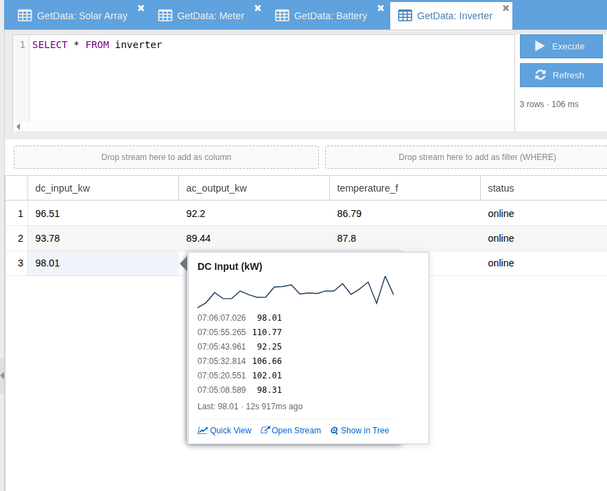
GetData result with a hover popover showing 'DC Input (kW)' — sparkline, six recent timestamped samples, last value with age, and Quick View / Open Stream / Show in Tree action chips
This is what “every cell is a temporal stream” looks like in practice. Hover any cell — the sparkline, the recent samples, the drill into the underlying stream are all right there, because the cell is the stream. No history table. No materialized view. No separate API.

Edit Any Cell — Set Value Writes Back to the Temporal Stream

Right-click Set Value to correct a historical reading at its original sample time or append a new sample. Same ingestion path as the REST API — same RBAC, same audit trail, same downstream derivation and rollup recalculation.
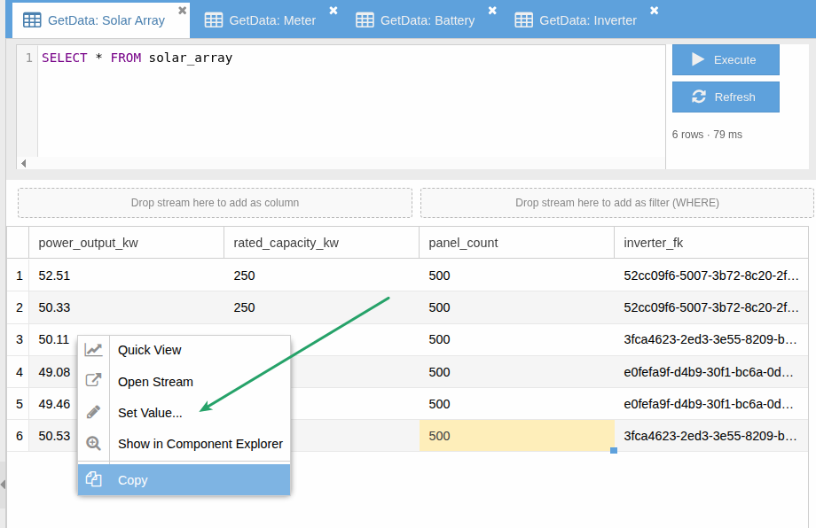
GetData result with the right-click action menu open on a cell — Quick View, Open Stream, Set Value, Show in Component Explorer, Copy
Right-click any writable cell. Set Value updates the underlying temporal stream at the original sample time (replace) or at "now" (append) — the same write path the REST API uses.

Follow Foreign Keys — Across the Entity Graph

Foreign-key columns are first-class: hover an FK cell, choose Follow FK, and a new GetData tab opens on the target template filtered to that component. Walk relationships one hop at a time.
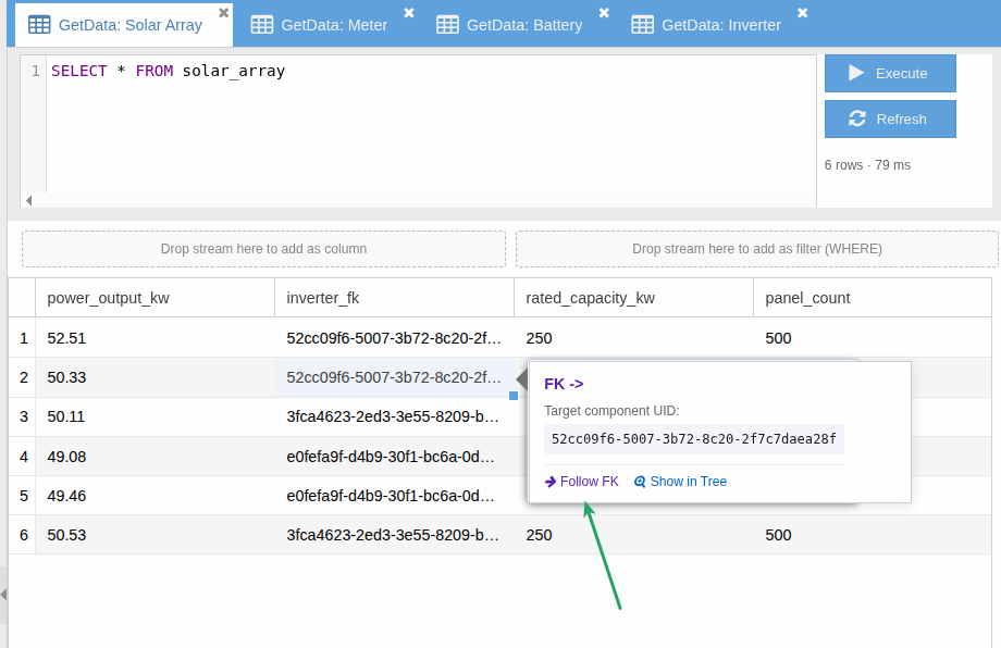
GetData result on a Solar Array template — hover on an inverter_fk cell shows the target component UID and a Follow FK action chip
FK cells expose the referenced component. Follow FK opens a new GetData tab on the target template, filtered to that one component.

Diagnose Derivations — Right from the Cell

Cells from derived streams carry their expression and dependents inline. Click Diagnose for the full Derivation Diagnostics window — expression source, each dependent's stream (cycle & stat), last-executed time, and a drill-into option to walk the derivation tree.
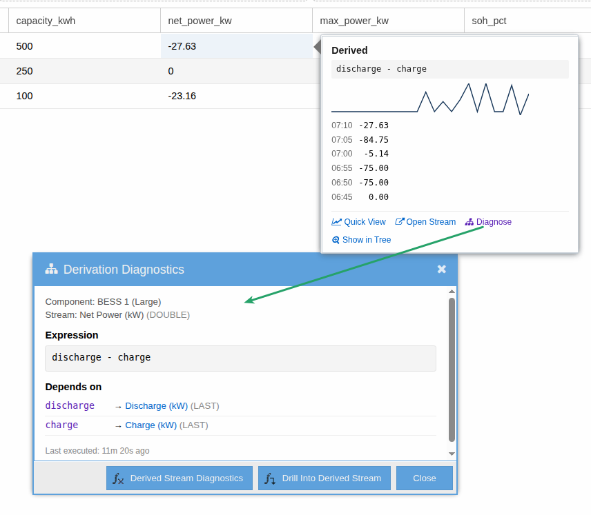
GetData hover on a derived cell ('Derived: discharge - charge') with sparkline and recent samples; Derivation Diagnostics window open below showing component, stream, expression, and clickable dependents
Hover shows the derivation expression; Diagnose opens the full diagnostics window with clickable dependent streams.

Dashboard Builder

The dashboard builder pairs a widget palette with a drag-and-drop canvas. Compose line charts, gauges, big numbers, tables, maps, and more — all wired to live stream data. Re-skin the result for any operational role with custom colors, layouts, and branding.
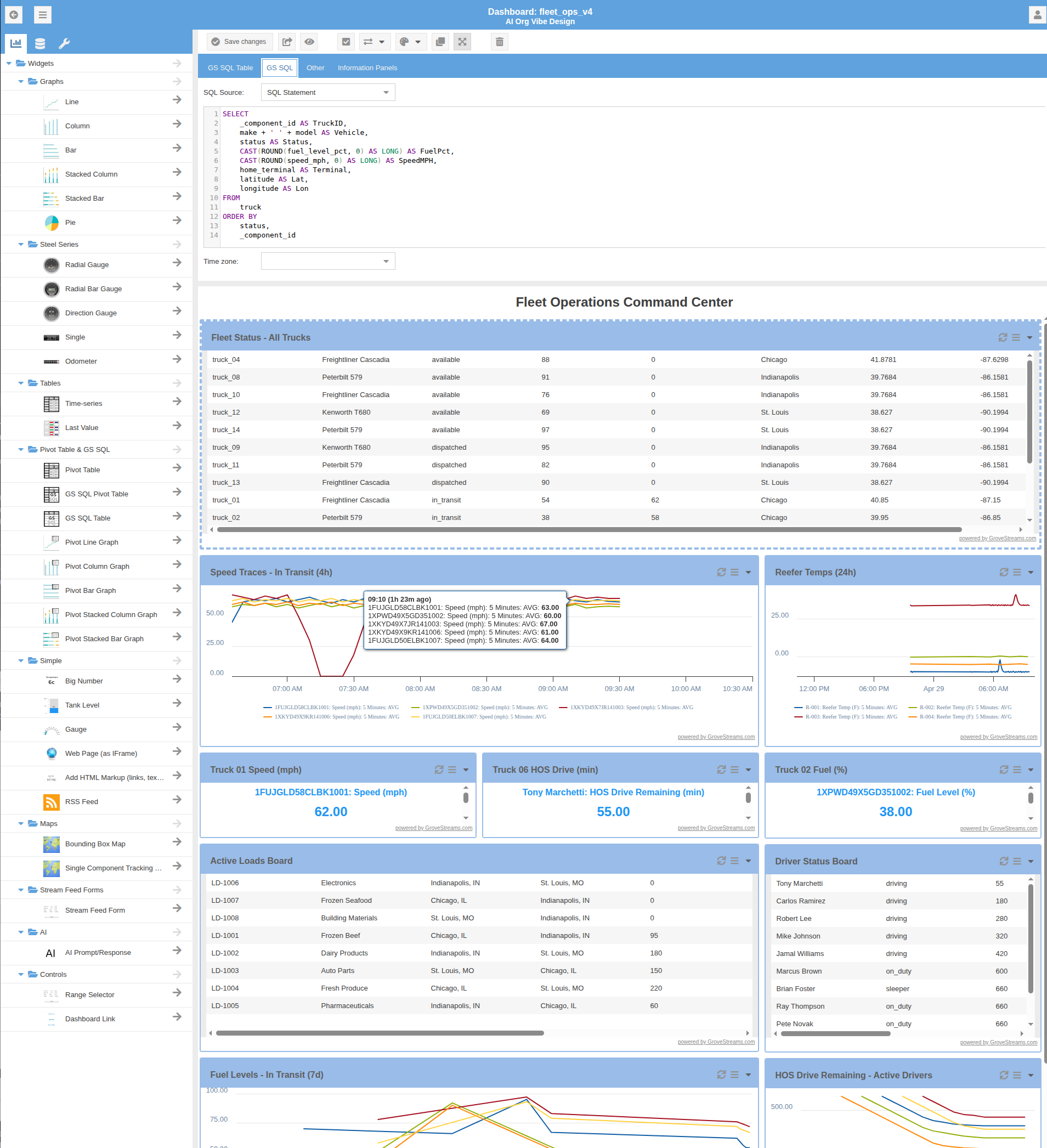
Dashboard designer showing the widget palette on the left and a 'Fleet Operations Command Center' dashboard composed of tables, multi-line charts, big-number widgets, and live trace charts
The dashboard designer — widget palette on the left, the canvas on the right, every widget bound to live streams.

Style It Your Way

Custom themes, colors, and layouts — configure the dashboard to match an operational role or brand identity.
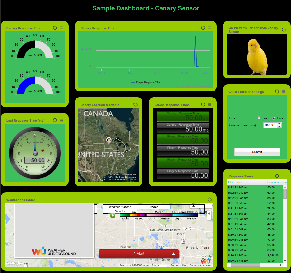
Custom-themed dashboard with a green color scheme, gauges, big-number widgets, and a map — styled for a 'Canary Sensor' use case
Custom-themed dashboard — same widget set, distinct visual identity.

Charts & Gauges

Big-number widgets, gauges, multi-line charts, and trend graphs — all bound to live stream data, with synchronized time ranges and shared zoom across a dashboard.
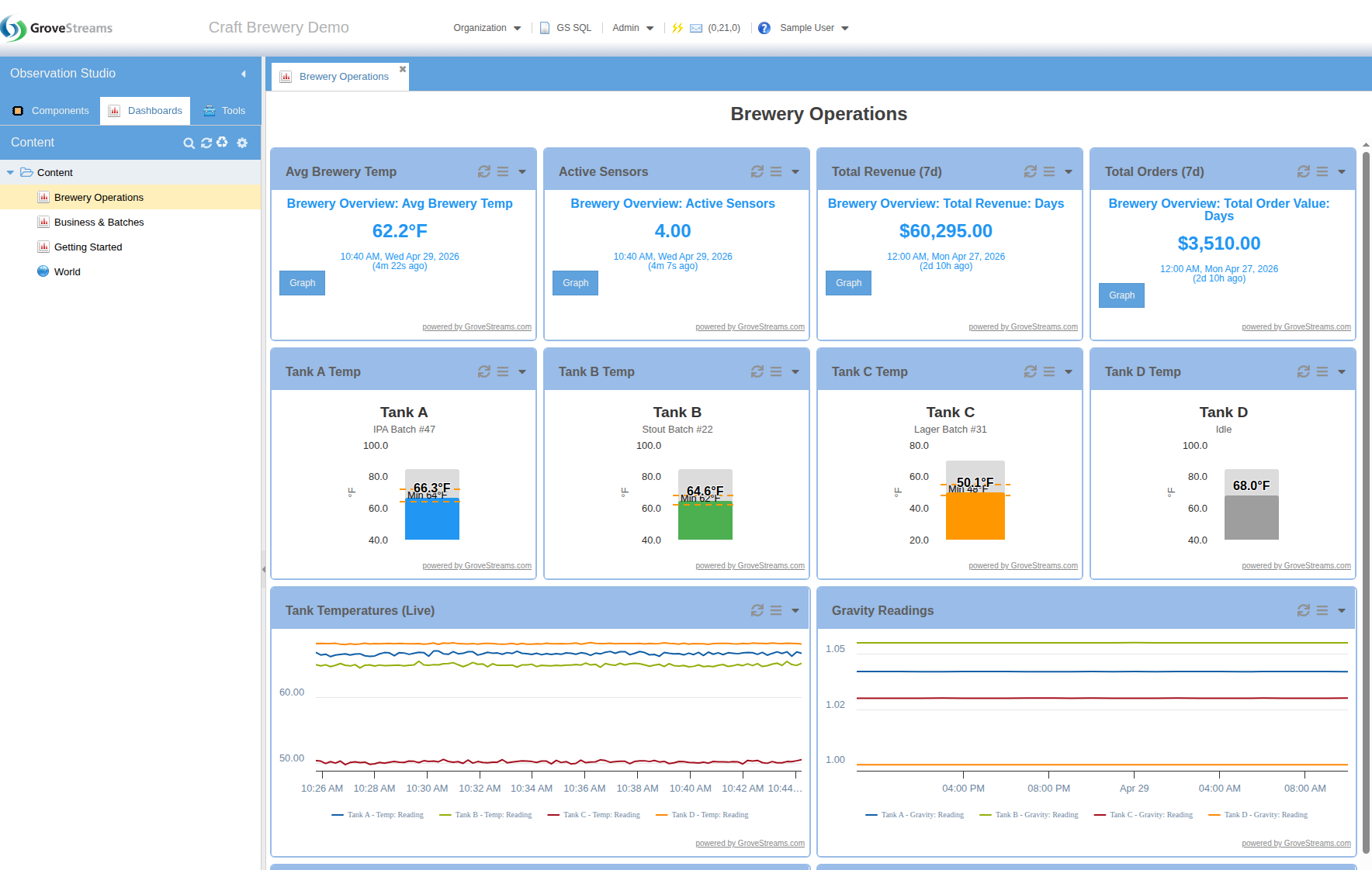
Brewery Operations dashboard with mixed widget types — big-number tiles, four tank-temperature gauges, and multi-line charts for tank temperatures and gravity readings
Mixed widgets on a single dashboard — big numbers, gauges, multi-line charts, all wired to live streams.

Stream Selection & Drag-and-Drop

Drag streams directly from the component tree onto any widget — steel-series gauges, big-number tiles, level indicators, and plain bar gauges all accept the same drop. Threshold-aware widgets then shift color (green / yellow / red) based on configurable bounds, so the dashboard tells you what's wrong at a glance — including latency thresholds that flag stale data.
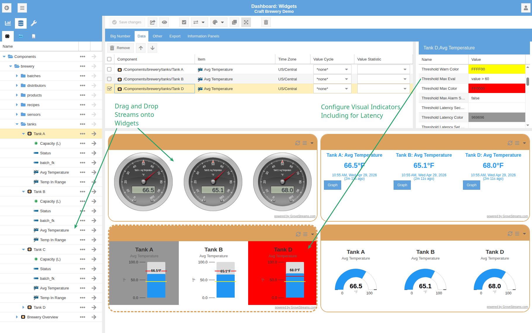
Brewery dashboard editor with annotated callouts — one pointing to streams being dragged from the component tree onto widgets (steel-series gauges, big numbers, level indicators, plain bar gauges), the other showing how to configure threshold colors and latency indicators
Drag streams from the tree onto widgets, then configure threshold colors and latency indicators — four widget types share the same drop target.

Gap Detection

Every stream tracks gaps natively — intervals where samples are missing relative to the expected cadence. Pick Base Gap Count or Base Non-gap Count as a roll-up statistic and chart the gap series alongside actuals to spot data-quality issues at a glance.
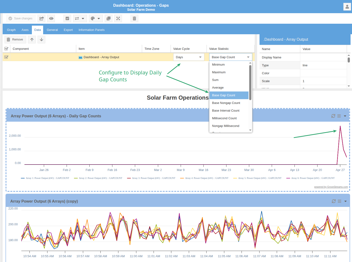
Solar Farm Operations dashboard with an annotated callout showing the Base Gap Count statistic option and a chart highlighting a daily gap-count spike with an arrow
Daily gap-count spike on a solar array — surfaced just by selecting Base Gap Count as the widget's value statistic.

Maps

Maps live alongside dashboards in the Content repository. Plot components and event locations across the world; drill into a marker to navigate to its component or trigger an action.
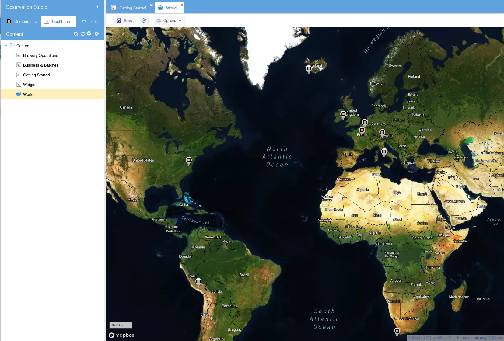
World map view from the Content repository — component and event locations marked across continents, with the Content tree on the left listing dashboards and the world map alongside them
A world map in the Content repository, plotting component and event locations — the same content tree that holds dashboards.

Pivot Tables

Group stream data by any dimension — component, folder, template, time period — and compute sub-totals and grand-totals on the fly.

Pivot Configuration & Chart Integration
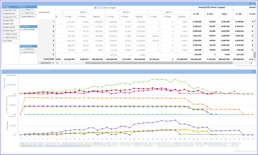
Pivot table with row/column dimension selectors at the top and three multi-line charts beneath, showing aggregated stream data plotted alongside the pivot grid
Drag dimensions onto rows/columns and values onto cells. The pivot lives inside a dashboard, so synchronized charts plot the same aggregations.

Label & Value Filters

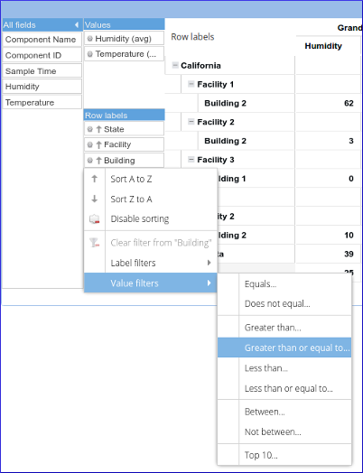
Filter rows by label (Equals, Begins With, Contains, Greater Than, Between…) or by aggregated value (Greater Than, Top N, Between…) — familiar from spreadsheet pivot tables, applied to live stream data.
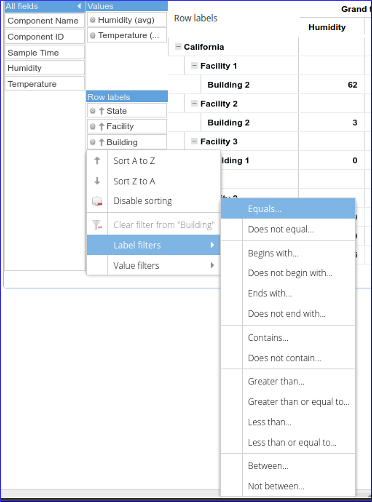
Pivot label-filter submenu showing options: Equals, Does not equal, Begins with, Contains, Greater than, Less than, Between
Label filters — Equals, Begins With, Contains, Between, etc.
Pivot value-filter submenu showing options: Equals, Greater than, Greater than or equal to, Less than, Between, Top 10
Value filters — Greater Than, Top N, Between, etc.

Export

Copy widget contents to the clipboard or export directly to CSV or Excel from the widget menu.
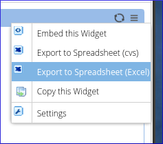
Widget context menu showing Export to Spreadsheet (CSV), Export to Spreadsheet (Excel), Copy this Widget, and Settings options
Copy or export to CSV/Excel — one click from any widget.

Build Your Dashboard

From raw streams to polished dashboards in minutes.

SIGN UP FREE